Making Space Cool
2nd of April, 2021 by Chris Correia
Oh boy, it’s been a while since the last post!
Today I’d like to talk a bit about the visuals of space in Centauri Rising and what goes into the art direction behind them. We’ll talk about the technological designs like ships and structures at some other time. Come over to discord to talk about this stuff anytime!
Space is already really, really cool! However, when it comes to making entertainment or art using sci-fi concepts and space as a backdrop, it’s a struggle between making things realistic and accurate and making the experience cool, larger than life and stylish. When it comes to scientific accuracy in most sci-fi, especially games and movies, realism gets thrown out the airlock faster than Jar Jar Binks at a Trekkie convention.
Jar Jar Binks.
A SPACE APART
In Centauri Rising, realism has its place as a tool to ground the player experience in the plausible and the serious. However CR also has energy shields, warp travel, lasers and all sorts of classic sci-fi tropes. This choice is deliberate as it seems to me that these tropes have penetrated our subconscious culture in a way that allows them to basically be space magic without detracting from the believability of their use. These kinds of tropes are used extensively in space games, but they aren’t always cool. It’s our objective with Centauri Rising to art direct every aspect of the visuals and the audio into a cohesive and striking package.
This means making choices that sometimes lean into realism and sometimes lean completely away from it, because we’re not serving one or the other, we’re serving an overarching objective of making everything look, sound and feel impressive.
As a specific example, we mostly use harsh shadows and little to none ambient lights in our levels. Light is fundamental to how something looks and in the context of space, having a single harsh light source and everything else dipped into near-black, produces a realistic high-contrast look as opposed to a washed out omni directional look that lacks focus.
CATCHING A VIBE
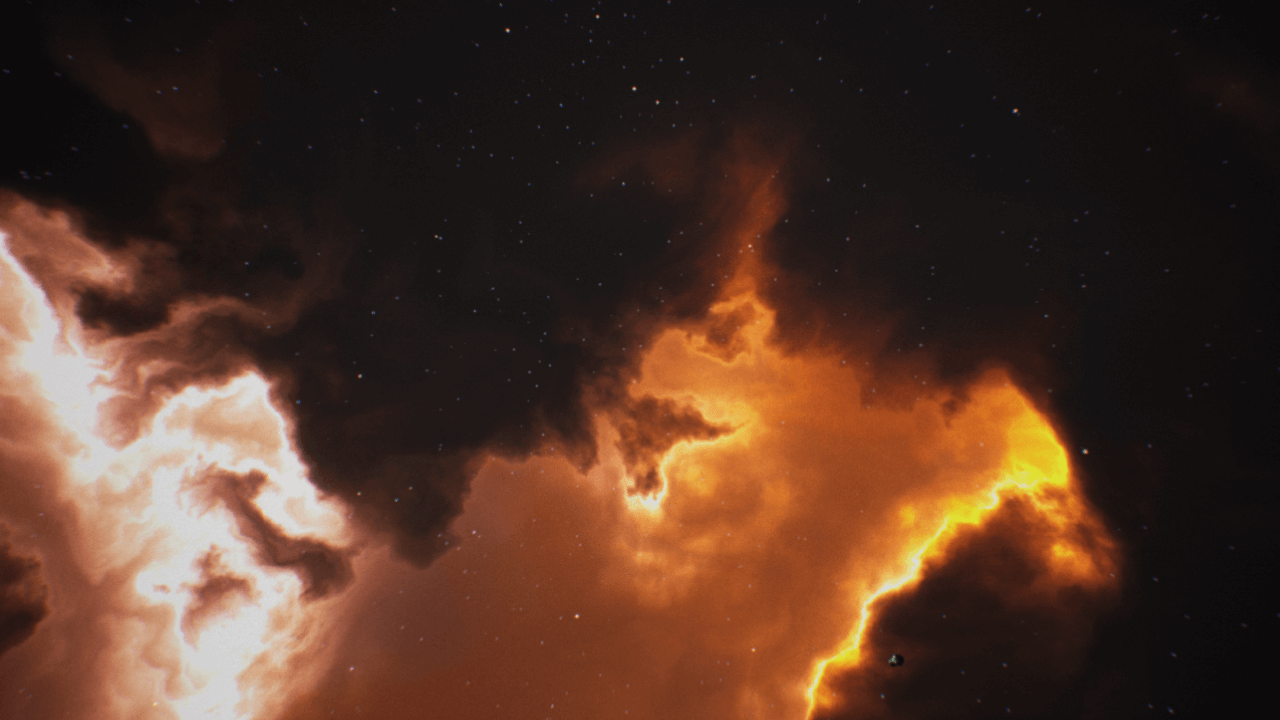
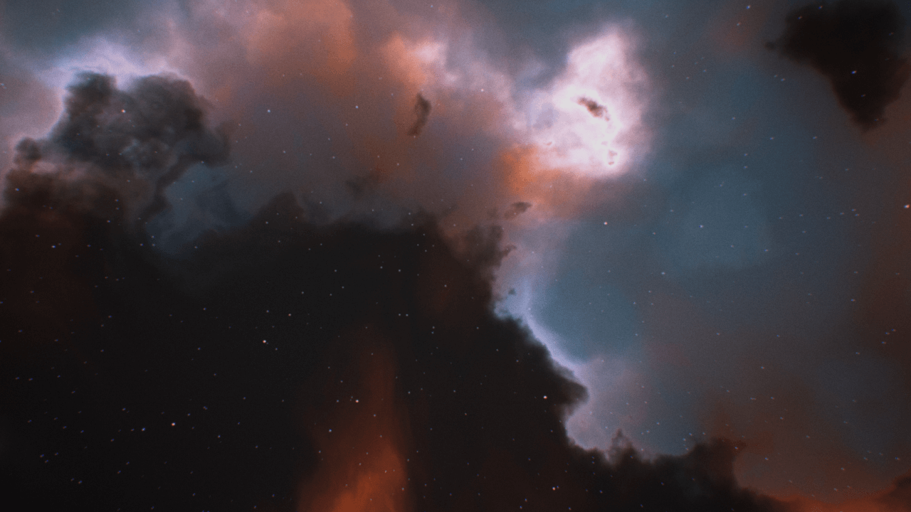
When it comes to the space backdrops and nebulas, we lean away from realism so we can continue to serve our goal. Centauri Rising draws a lot of stylistic inspirations from the Homeworld series, which was arguably the first space game to elevate the experience of being in space to something almost mythological. The legendary nebula backdrops of Homeworld are something I knew I wanted in Centauri Rising from the very start. Our approach to them is quite different, but the super exaggerated colors and bright soft nebulas in CR are a direct homage to Homeworld’s fantastic art direction. They provide a much needed sense of scale and character to the backdrops, making the player feel like they are deep inside an unknowable cosmos, becoming entranced by its beauty.
How do you feel when looking at these backdrops? I’d love to know! Join our discord to hang out and get in touch with us directly.
Stay updated with our Newsletter
Sign up for our newsletter to receive exclusive updates on the development and special offers. We pinky promise to NOT spam you.


